Ticketmaster Virtual Queue
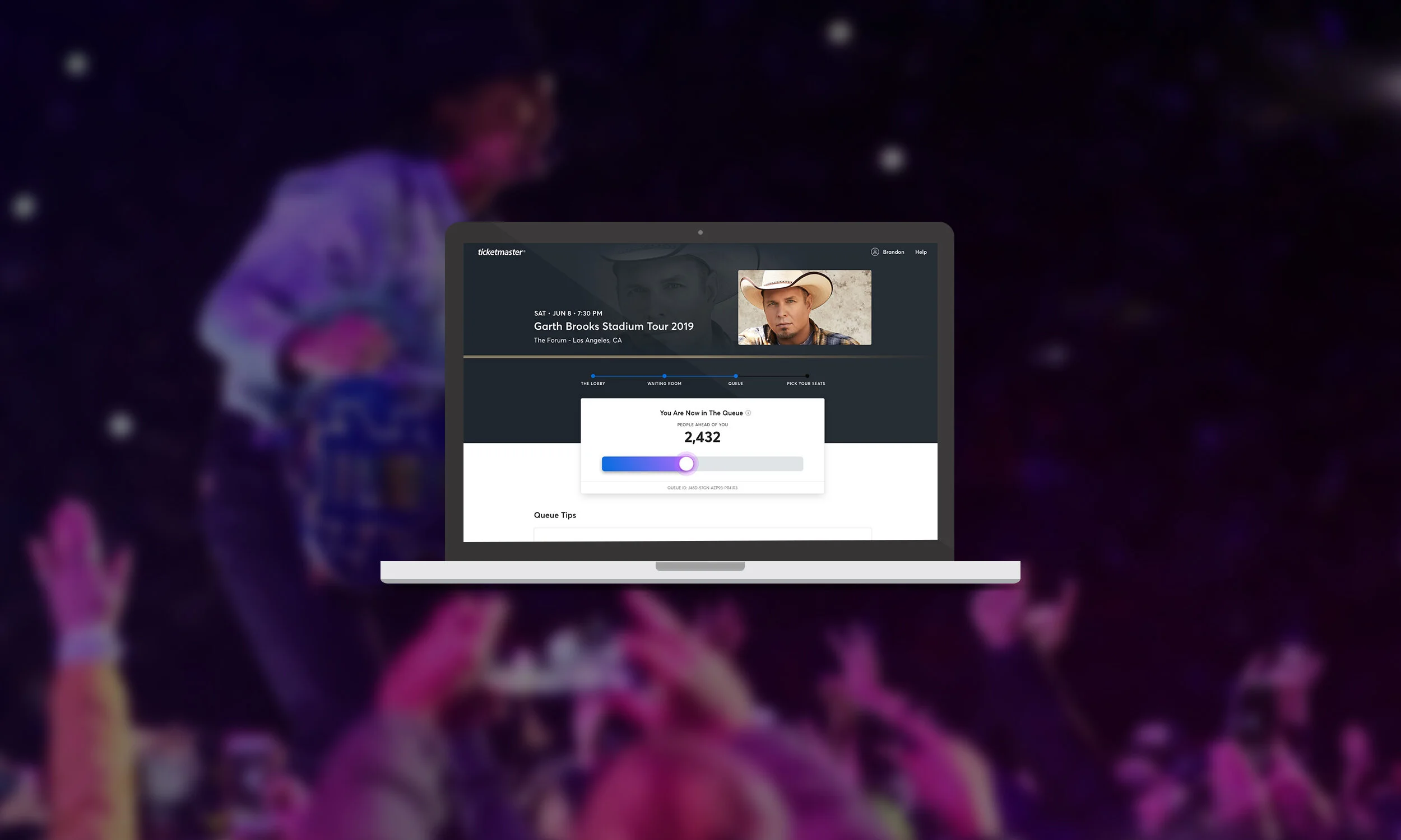
Ticketmaster is the leading ticketing platform in the world. On the day of high demand ticket sales, fans not only compete with each other to purchase tickets, but they compete with automated bots. The Virtual Queue is a unique product that funnels hundreds and thousands of fans into a virtual line, while blocking bots — so that the fans have fair access to purchase tickets.
Collaborations
As a Lead Product Designer I’ve had the privilege to partner with super talented Researchers, Product Managers, Engineer Leads, and Design Partners to make this all happen. If it weren’t for them, this product wouldn’t be where it is today.
Problem
Our current Queue experience does the job it needs to do. It tells the user their place in line, event details, and any real-time messaging that needs to be relayed — but it doesn’t go beyond that. Some blind spots we didn’t cover in our current experience:
Do first time users who come in through the queue experience know why they have to wait in line in the first place?
Do fans know the different steps that take place when going from a waiting room to queue?
Are we educating fans on how to best prepare for a sale?
Do users feel engaged when entering a queue, or is it just a grooling process?
A super high demand event sale has anxiety written all over it, so how can we mitigate fan anxiety by educating and engaging them to a smooth purchase experience. And if fans aren’t able to buy tickets because of low inventory, how can we educate them early enough to mitigate their expectations?
Assessing the Situation
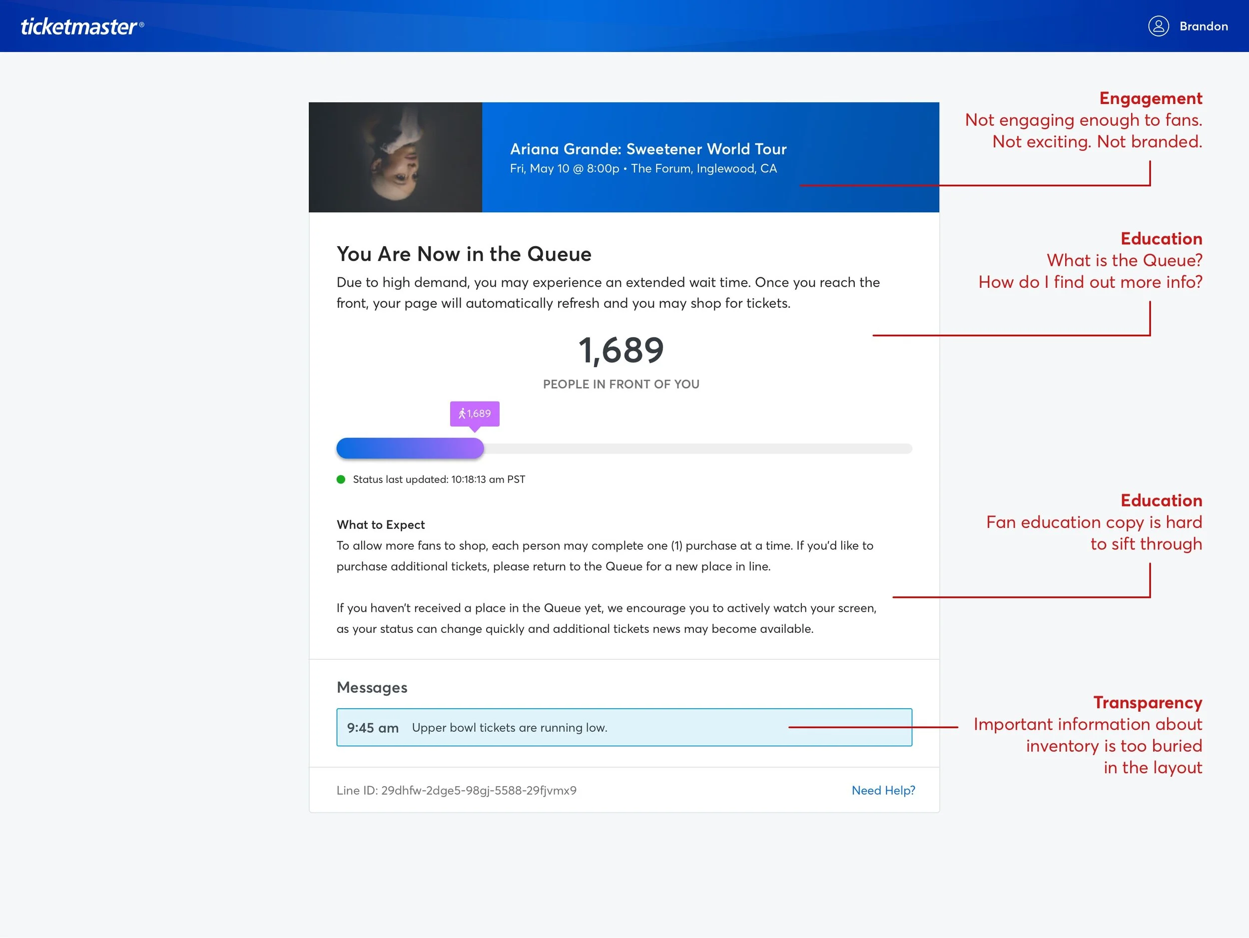
Before starting on initial mocks, I mapped out current experience and found that we do a lot of things in the back-end that users have no context of. We take users from an event info page, to a gateway page, to a waiting room, then finally to the queue. How would users even know where they are relative to the actual seatmap page if we’re making them jump through so many hoops? There were definite pain points in our process and a lot of internal jargon that we don’t clearly define for our fans.
Current Experience:
Research
We had a plethora of user feedback and data using 3rd party tools and gauging NPS scores. One of the most useful way to get immediate response of frustrated fans is Twitter. Fans are extremely vocal about their frustrations via social media, so what better way to gather data than checking our Twitter.
You can pretty much summarize the emotions of what fans go through during these high demand sales, and its: anxiety, frustration, and sometimes anger. Taking the feedback of previous sales, I brainstormed with our UX Researcher to come up with some scenarios and questions that would help get more qualitative feedback. Some questions we explored were:
If you’ve ever waited in a virtual line for concert tickets, what’s your typical routine?
What would help you feel more at ease when waiting in line?
How would you do if you found out you had over 2,000 people ahead of you?
How would you feel if you had a lot of people ahead of you and our system told you that your chances of scoring tickets were very low?
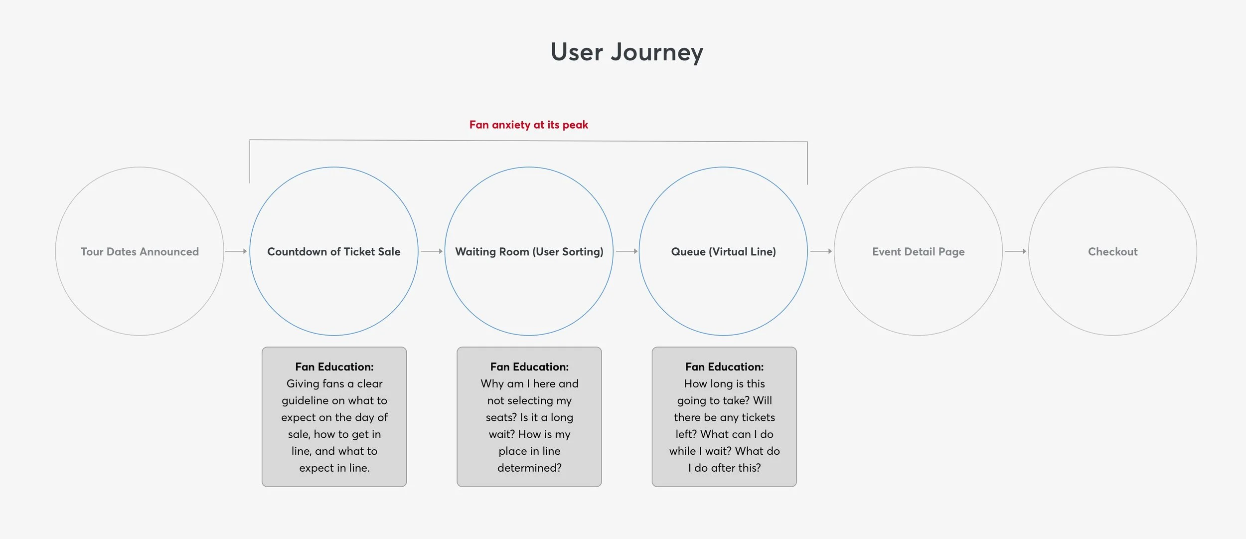
During our research we found that a lot of users understood the concept of a virtual line, but they didn’t understand how it worked. They had trouble understanding the different states of the queue (countdown page, waiting room, queue) and why that was relevant to this sale experience. They didn’t know how the system determines their place in line. In general, there were a lot of questions that we don’t answer for the fans when they enter into this high anxiety experience. This helped me tremendously as I worked through some design solutions. From all the data I gathered I categorized our main 3 pain points into these buckets:
Education. Transparency. Engagement.
Solutions
Education:
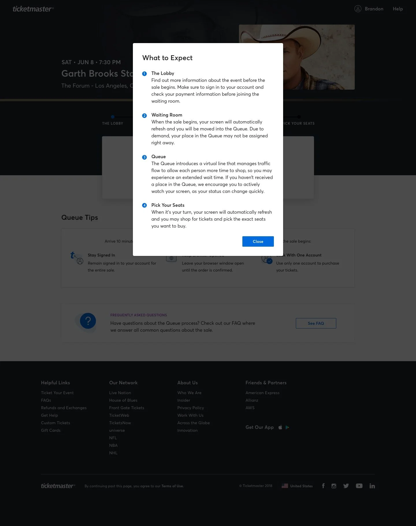
Fans should know how a sale works from countdown to queue, and know what to expect in each step.
Fans should know how to best prepare for the sale.
Fans should know technical limitations of the queue such as: knowing not to use multiple browsers, having a good internet connection, not refreshing the browser, and etc.
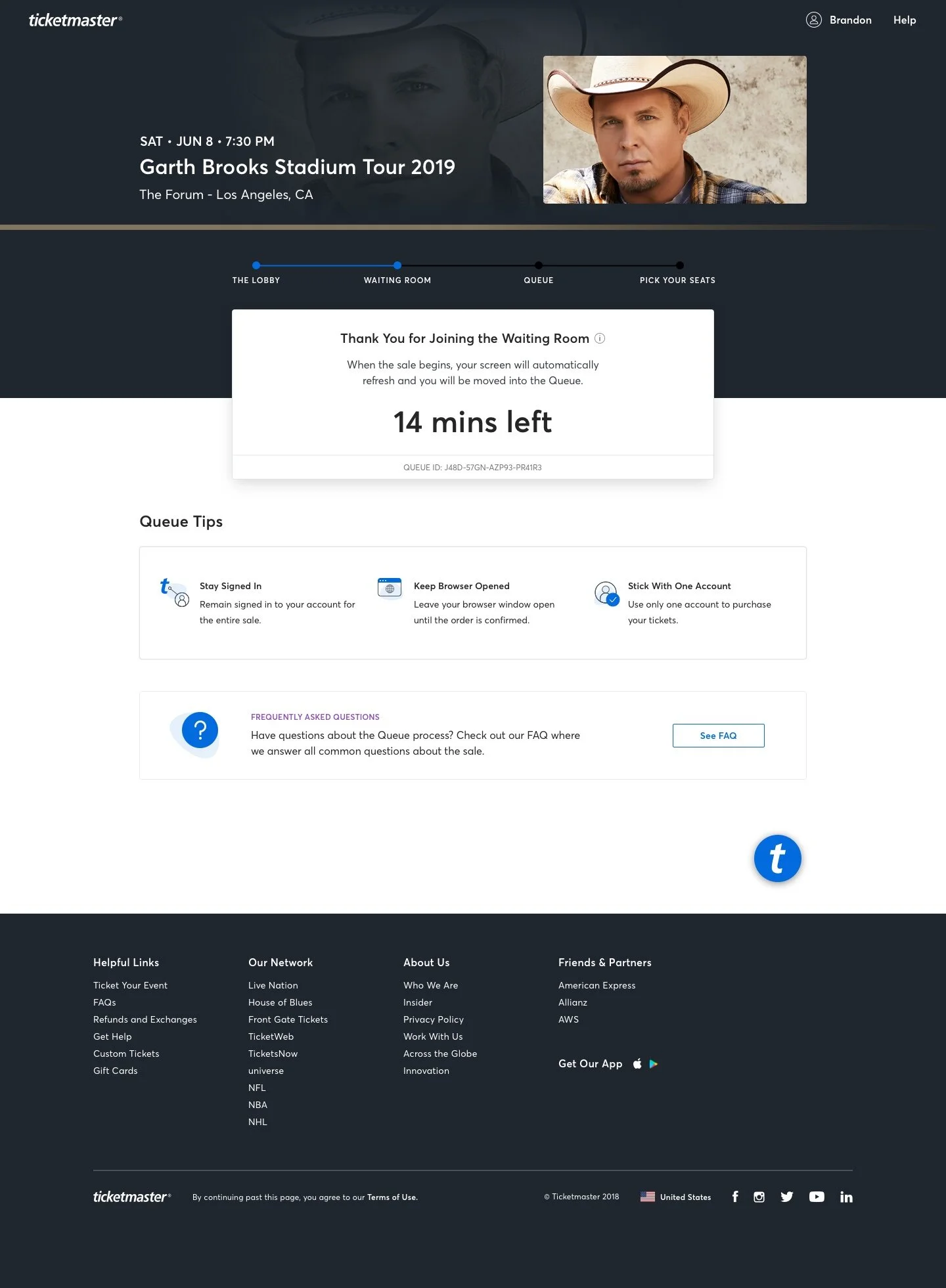
Users can now see where they are in terms of getting in line for the queue, and be informed of what’s ahead.
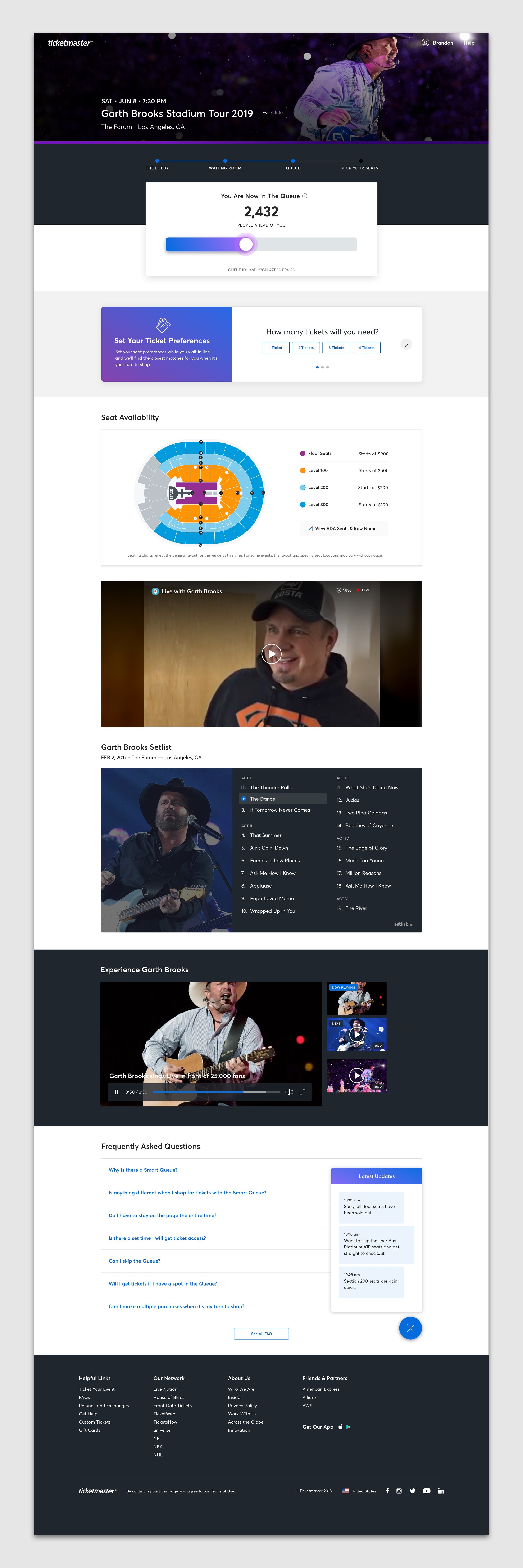
Users can now see educational content on how to best prepare for the sale. FAQ card was added so users know where to go when they have more questions.
Transparency:
Fans should understand that there are limited inventory.
Fans should know their place in line.
For any updates that fans need to know, we surface a fixed messaging model so users don’t miss out.
Engagement:
Queue experience should be immersive and more artist branded. Fans should feel excitement, not dread.
Visuals should be more eye catching and pleasant to look at, not stale and corporate.
Fans should see more content by the artist to keep them engaged on the page.
New header pulls in artist images from our repository to allow for scalability and automation. Accent gradient color strip grabs the average color of the image to add more to the artist brand.
There were many iterations of the design as it has many stakeholders involved. My Product Manager and Dev Lead had to work extremely close because of the many technical and business requirements. On the technical front, there’s a ton of effort that go into building a product that involves security, modularity, bandwidth load, and timed events — so constant communication with my dev on what was possible and not was very important.
Final Mocks
Iterations & Future
There’s still a great amount of potential for this product, and our team is currently brainstorming on the future state of this experience. High demand tours will almost always be met with a high influx of purchasers, and that influx of purchasers will almost always be in line, but that doesn’t mean it has to be dreadful.
The future experience should be more than just a stale waiting room, where users go and count down the timer until it’s their turn. We want to be able to serve relevant content to the users in a more engaging form such as artist music videos, tour setlist playlist, merchandise, live Q&A, and much more. Fans should feel connected with the artist, even if it’s before they make their purchase.

