
Project Overview
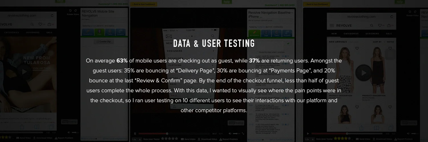
REVOLVE's mobile site users are growing rapidly by each year. Recent reports showed that 40% of our traffic were coming from mobile devices, and out of the 40%, more than 15% of conversions are from new/guest users. That's a big number considering the fact that REVOLVE has their own app. After reading and analyzing data, the product team made it a priority to optimize and update our checkout experience -- to ensure that new and returning users have a quick and seamless flow from beginning to end.
ObjectiVe
Gather user interaction data on major points in the conversion funnel (Product Detail, Shopping Bag, Checkout pages) and identify any friction in the process. Provide UX recommendation based off of data and user testing. Run A/B tests on design and functionality improvements to measure impact on conversions, bounce rate, and cart abandonment. Working with designers and developers to implement any permanent features from A/B test results.
Ideation
During my research I found some great resources that gave insights on the e-commerce industry's mobile site conversions, which helped me do a thorough audit on our mobile site checkout. Google has a great article on "Principles of Mobile Site Design" and Internet Retailer has a great article on industry standards for mobile conversions. These resources helped me make design decisions that were appropriate in REVOLVE's context.
Role
I was the Product Manager & UX Designer for this optimization project. My responsibilities included: research industry examples, create competitive analysis, create flow & wireframes for suggested design, and A/B test new designs for implementation.
Competitor Analysis
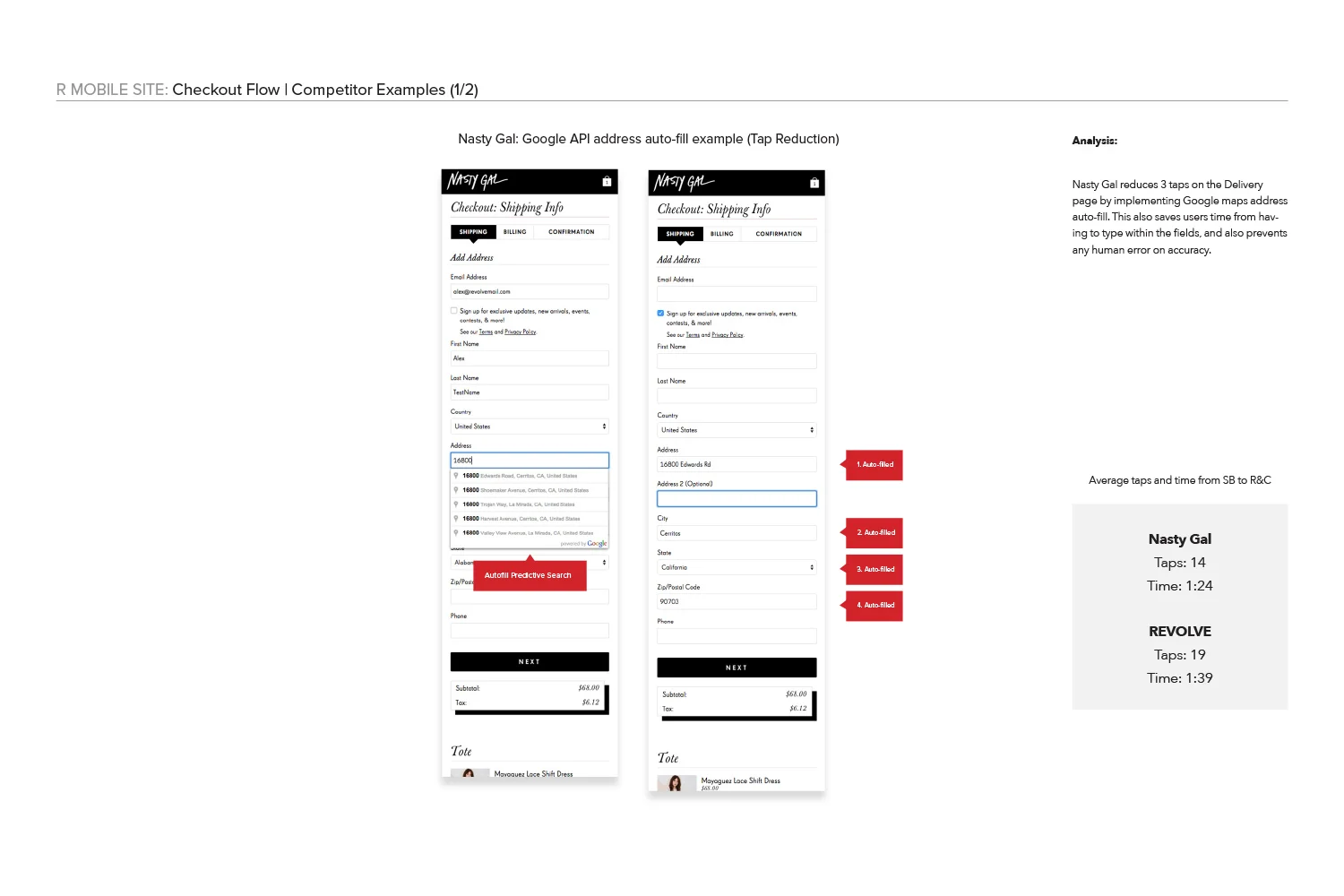
The competitors below had some great examples of quick and efficient checkout process. Using our checkout funnel data and the competitor checkout flows, I took the best features that these competitors had and implemented them into a mock.

CURRENT CHECKOUT FLOW
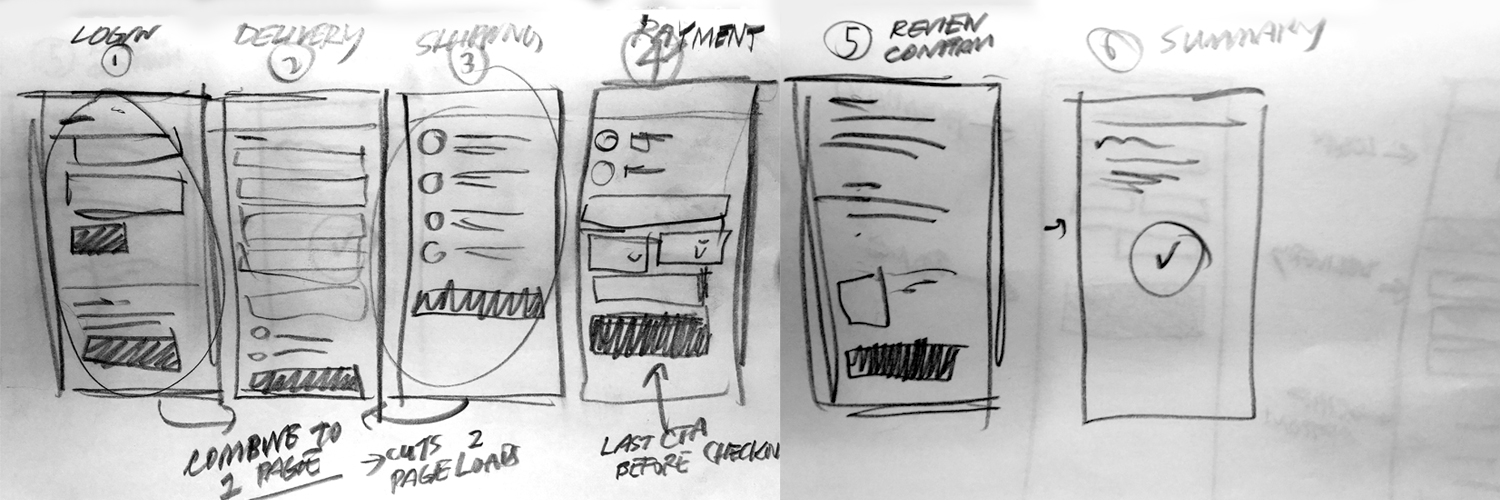
For Guest Users, It took approximately 5 page loads after the shopping bag page for the user to get from start to finish. It's a lot of pages to get through especially if the users are going through it for the first time, and I could see why a lot would abandon the process. After some evaluation I took some time to sketch up a solution that would consolidate some pages and thus cutting down the checkout time.
Design Decisions
I figured that since the Address page and Shipping Option page were directly related, I consolidated the two into one page. To cut another page load, I added the login section for returning users at the very top. Since ALL users have to proceed from their shopping bag page, why not put the returning and guest users in the same page. Returning users won't lose a step in their login and guest users can just carry on. Lastly, I removed the "Review and Confirm" page and made it so that the Payment Page was the very last step in their process. Users can easily review their purchase by using the top navigation or they can easily make the purchase. All these design decisions allowed for a 2 page checkout.